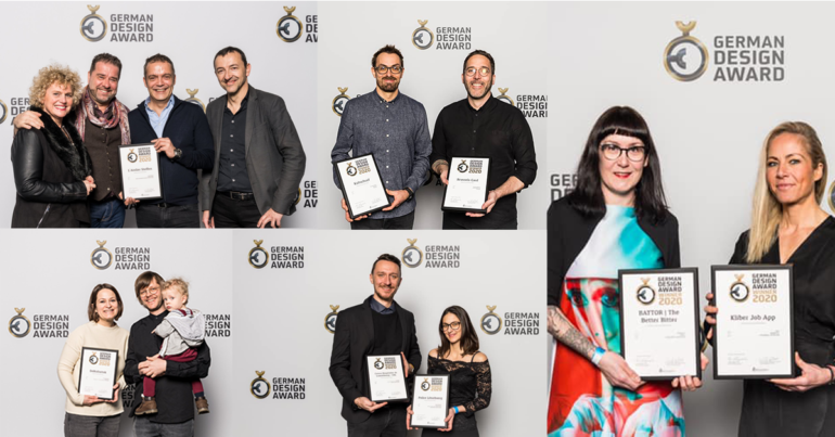
Annoncés dès novembre, les lauréats du German Design Award 2020 ont été consacrés lors de la cérémonie officielle organisée le le 7 février dernier à Francfort.
Une cérémonie qui a réuni une belle brochette de designers et d’annonceurs luxembourgeois puisque a designers’ collective, cropmark, kontext, ID+P, Rose de Claire design et Quattro Creative font partie des agences et studios lauréats de cette édition 2020:
a designers’ collective – Battor
Winner – Excellent Communications Design
Catégorie: Packaging
The boldly executed design shows the bitter orange in a highly abstract, yet clearly recognisable form. A label lavishly finished with gold and embossing technology, which owes part of its high-quality impression to the combination of blue and orange, refers winkingly to the aristocratic Luxembourg house of Orange-Nassau.
Statement of the jury

a designers’ collective – Kliber Job App
Winner – Excellent Communications Design
Catégorie: Apps
The app supports job seekers in applying for positions through video, to help them create the optimum presentation of themselves. The app interface is friendly, clear and easy to understand, guiding the user from production to submitting the application.
Statement of the jury

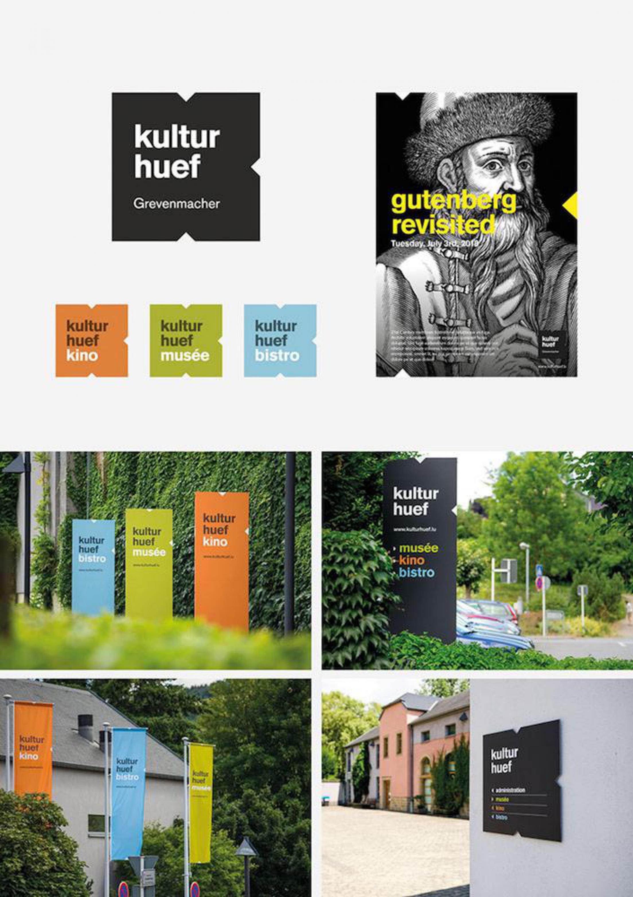
cropmark – kulturhuef
Winner – Excellent Communications Design
Catégorie: Corporate Identity
Through the deletion of little triangles on three sides, the letter »K« has been created from a square that becomes a distinctive logo when combined with the font. A strong signet that represents the cinema, museum and bistro areas through simple colour-coding. The result is a minimalistic, timelessly elegant design that is suited to a range of communicative uses thanks to its practical square form. Brilliantly executed.
Statement of the jury
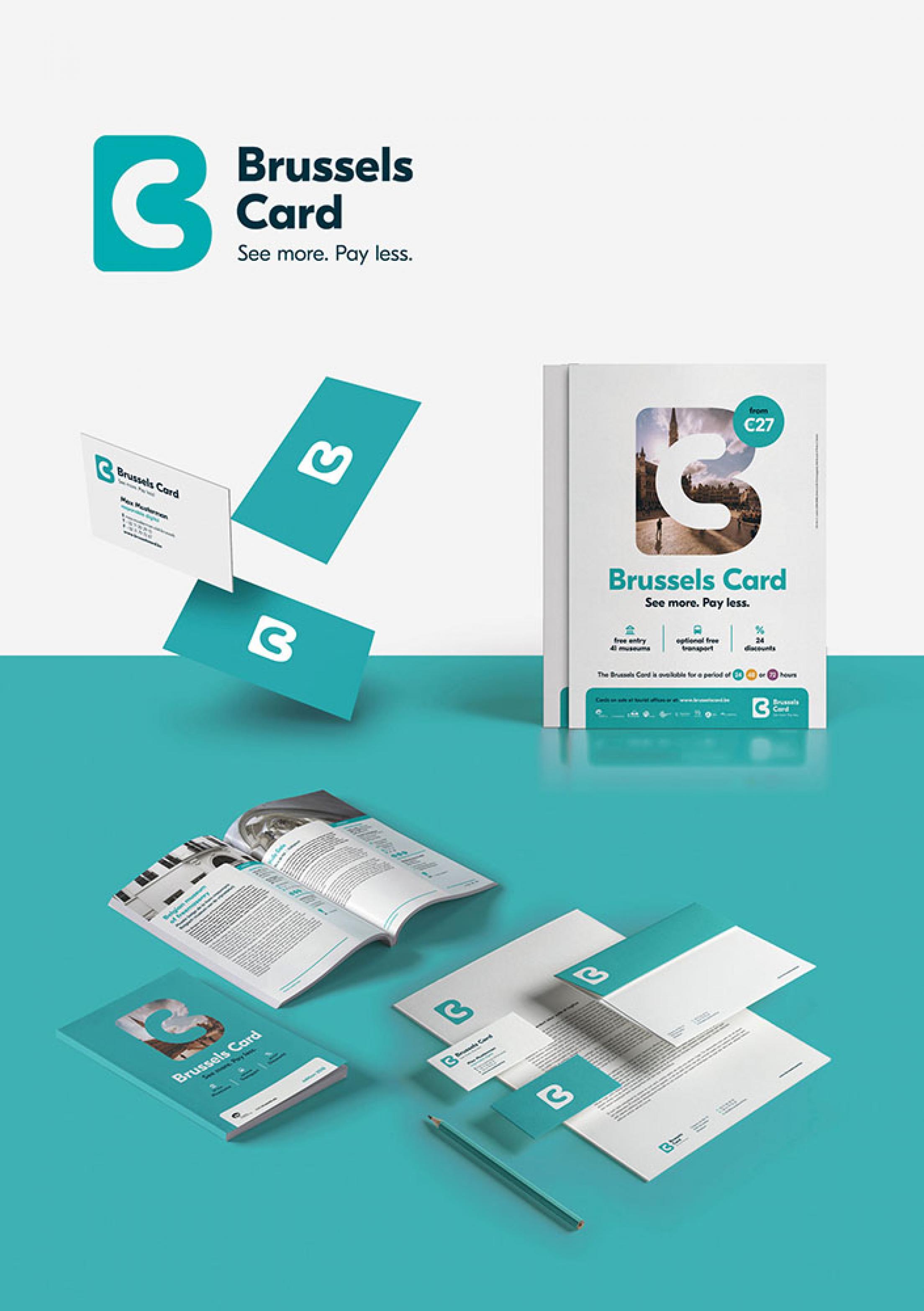
cropmark – Brussels Museums
Winner – Excellent Communications Design
Catégorie: Corporate Identity
The merging of the initials »B« and »C« to create a logo has worked perfectly and gives the presence its own identity. The distinctive signet is a central creative element in the company’s image that attracts a high degree of attention. Moreover, the letter »B« in the logo serves as a flexible, multipurpose space in which tourist attractions and snapshots of the town can be integrated. An elegant solution.
Statement of the jury
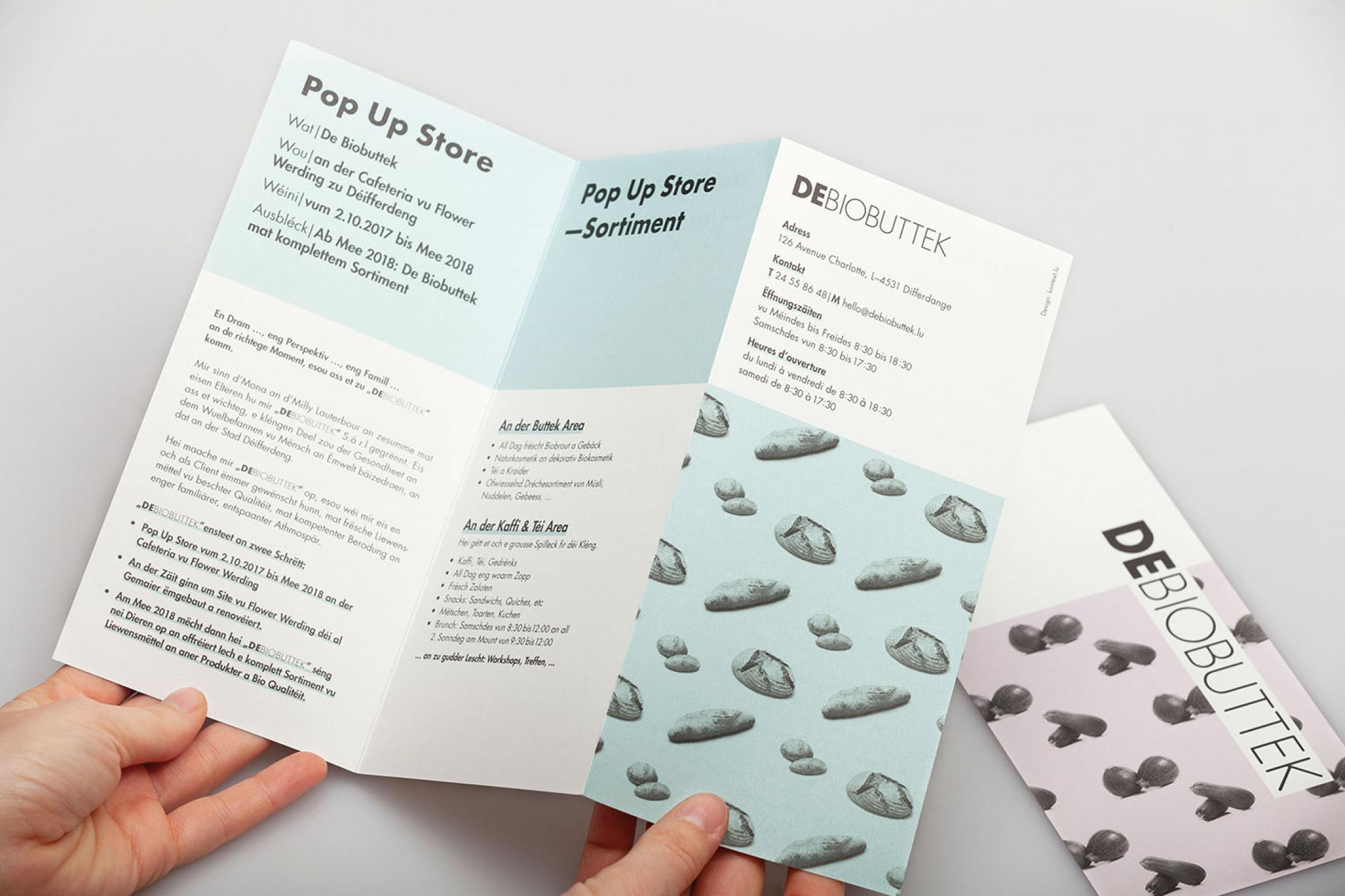
kontext – DeBiobuttek
Winner – Excellent Communications Design
Catégorie: Corporate Identity
The rounding off of the Futura font with duplex-coloured, grid-like patterns that are constructed from food gives the brand image a particular aesthetic. The surface-structured design looks appealingly clear and open. An interesting design that you do not see every day in this field, which makes it stand out even more.
Statement of the jury
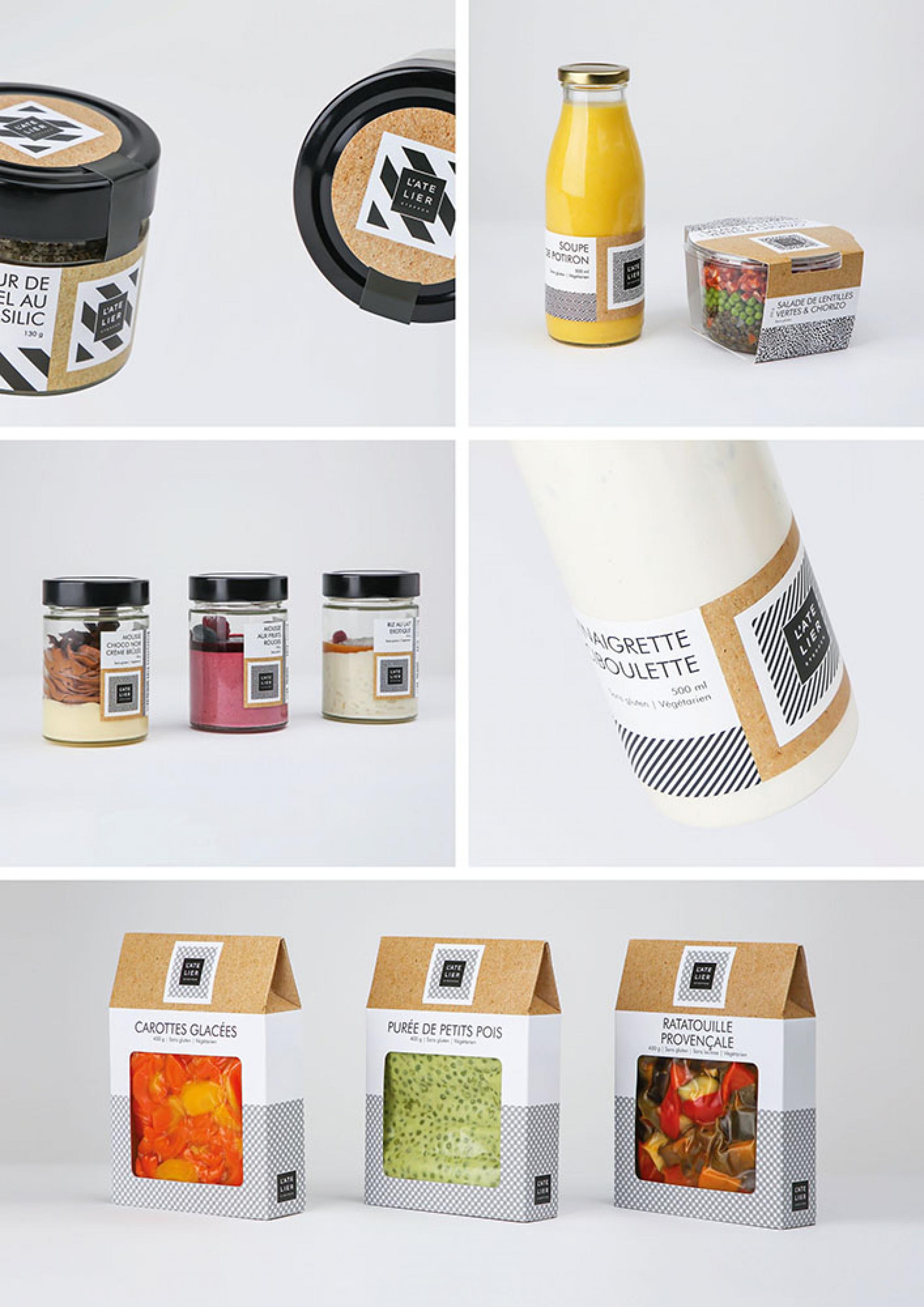
ID+P – L’Atelier Steffen
Winner – Excellent Communications Design
Catégorie: Brand Identity
The excellent graphic design combines elements from art, architecture and fashion to create an unmistakable identity. Even with the graphic pattern varying from one product to another, the brand retains its recognition factor across all media despite its minimalist design.
Statement of the jury
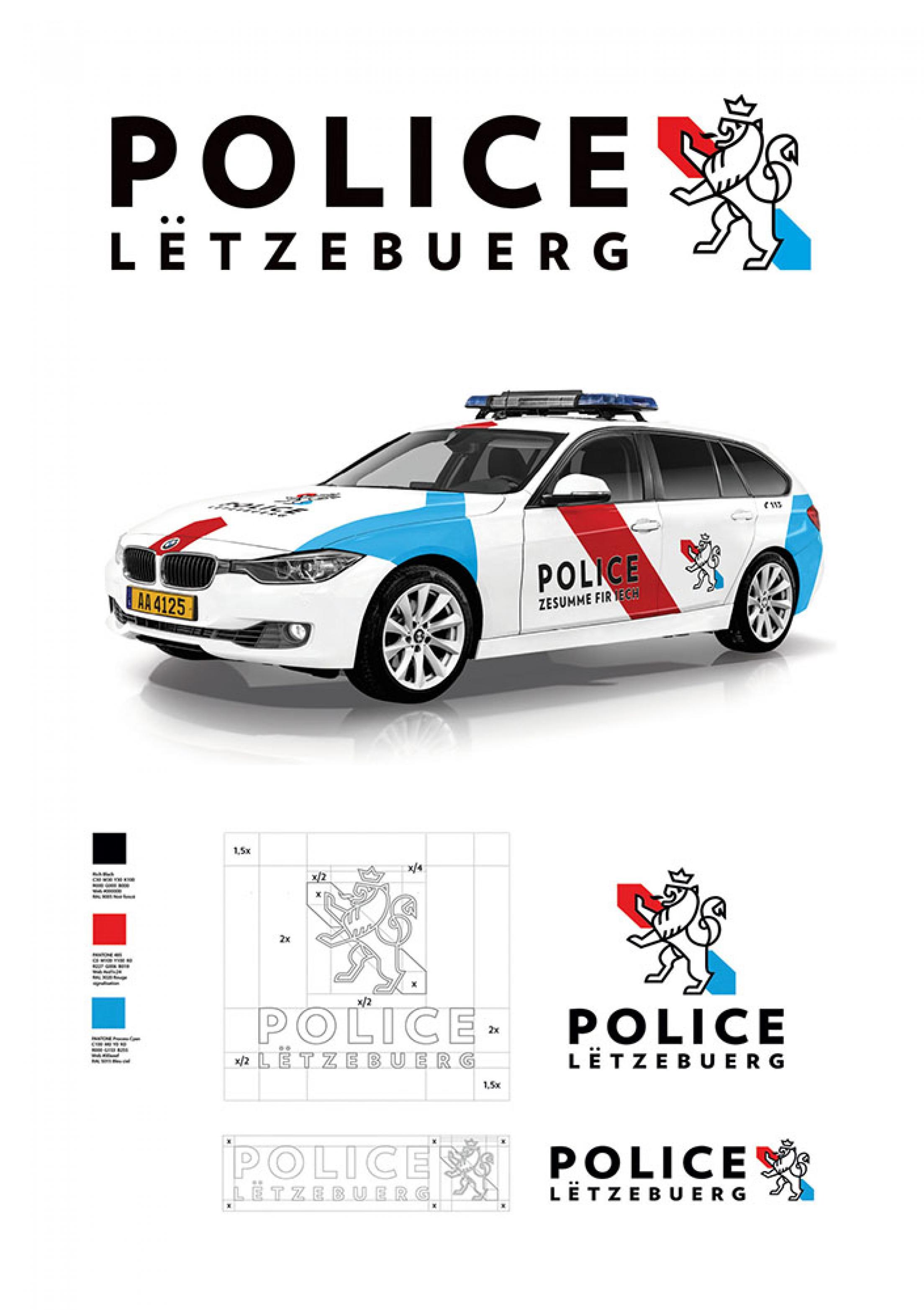
Quattro Creative – Police Lëtzebuerg
Winner – Excellent Communications Design
Catégorie: Corporate Identity
The new logo sets the lion from the former logo »free«, modernising them through clear outlines. A simple design with the two arrows in the state colours of red and blue accompanies the lion in its future presence that looks as dynamic, modern and clear as the logo and represents the police and their contemporary, people-oriented way of working.
Statement of the jury
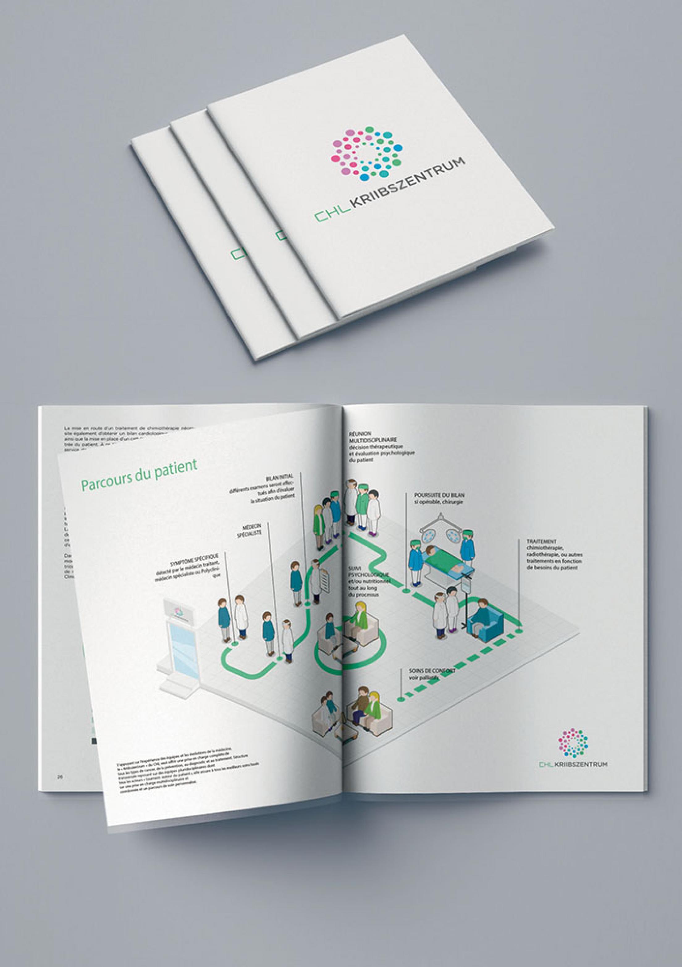
Quattro Creative – CHL
Winner – Excellent Communications Design
Catégorie: Editorial
The simple illustrations appear friendly and modern, clearly and concisely showing the patient’s path through the different wards. Additional colour coding helps further clarify matters. A good approach to dealing with a difficult topic.
Statement of the jury
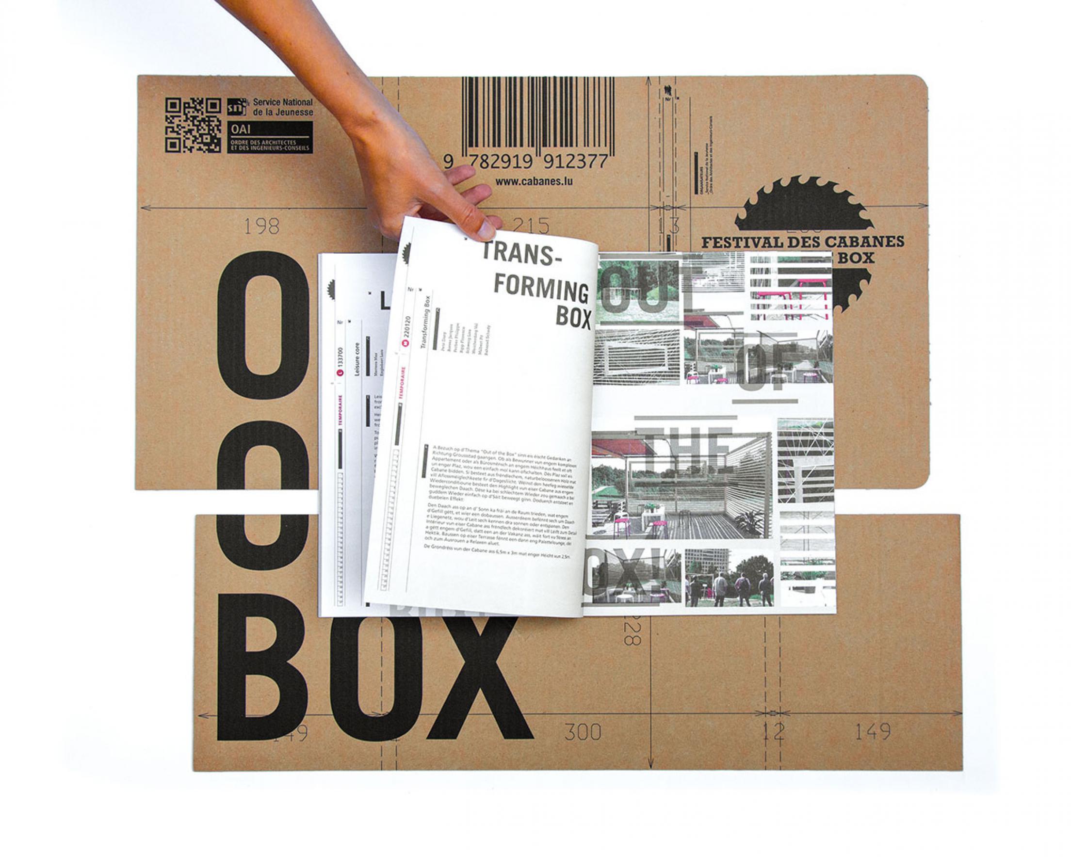
Rose de Claire, design – OAI
Winner – Excellent Communications Design
Catégorie: Editorial
The folding carton that forms the cover perfectly conveys the theme of »Out of the Box«. The interior of the brochure has an appealingly contemporary design, with layout, visual language and texts coming together to form a coherent whole that express the educational claim of the project in a clear and comprehensible way.
Statement of the jury
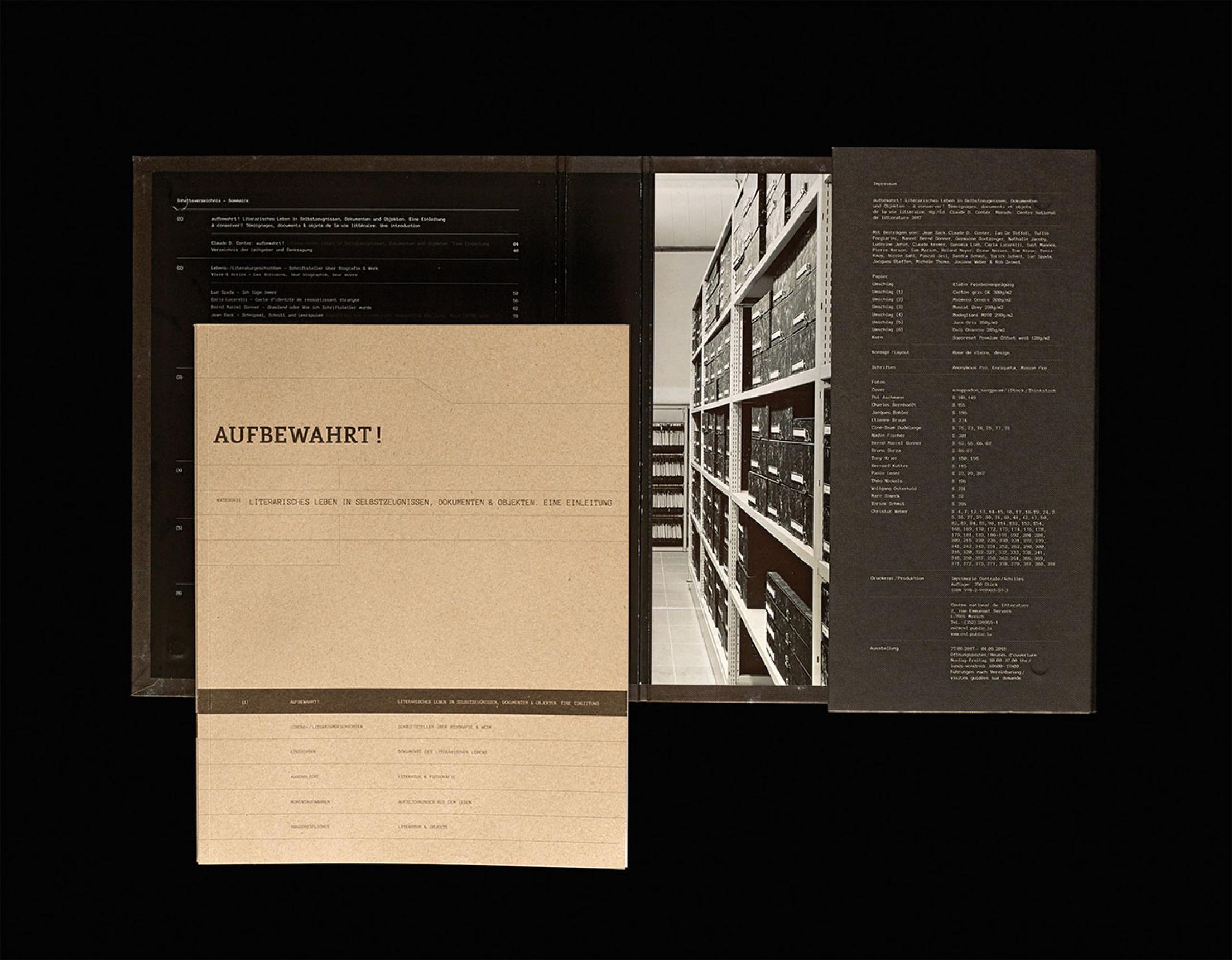
Rose de Claire, design – CNL
Winner – Excellent Communications Design
Catégorie: Editorial
When connected with the corresponding texts and personalities, exciting and compelling stories emerge from what may at first glance seem to be arbitrary objects. An interesting exhibition concept, suitably backed up by the accompanying catalogues and their consistently executed archival design.
Statement of the jury
Dans un domaine qui nous concerne moins, celui de l’architecture, un autre acteur luxembourgeois s’est distingué cette année. Il s’agit de Florian Bylow du cabinet Holweck Bingen Architectes, pour la réalisation de la Chapelle Soeurs franciscaines de la Miséricorde à Clervaux.